This guide breaks down how to create a landing page that converts, guiding you through the process of selecting the right tools, crafting compelling content, designing with impact, and testing to ensure peak conversion rates.
Everybody knows Disney and Pepsi logos. It’s hard to pass by KFC or Starbucks billboards without thinking about their food. Coca-Cola’s red is so characteristic that they’ve managed to make their huge corporate trucks the unofficial symbol of Christmas.
Would you like your company to be equally recognizable?
Every person visiting your website will decide if its content is interesting within a fraction of a second. When driving on a highway or through a jammed city, images on billboards attract attention much more than the words written on them. That’s why it’s so important to create a good logo.
It’s the best way to be noticed!
What is a logo?
It’s a graphic symbol that represents a given brand. You can create a unique logo that will automatically be associated with your products or services, regardless of the industry you work in, type of clients or the nature of the store. There are a few things you should keep in mind if you want to create a good logo design.
Qualities of a good logo
Your company deals with dozens of minor activities every day, employs dozens of employees and suppliers. It evolves, adapts and eventually offers hundreds of different products. That’s why it’s very hard to put all that into one image.
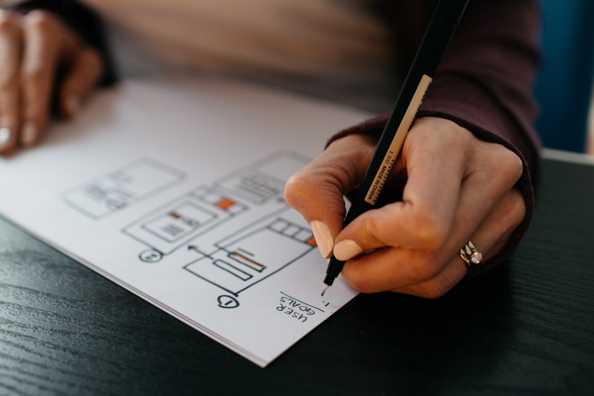
The first and most important step is brainstorming and creating preliminary sketches. Think about the message you want to convey to your audience. Focus on that or the flagship product of your brand. Then, together with a graphic designer, create several versions of the logo that reflects them.
Here’s a list of the qualities of a good logo:
- Accessibility – its meaning should be legible and easy to understand to all clients;
- Aesthetic – proper fonts, colors and arrangement of elements;
- Uniqueness – copying existing designs is illegal and might confuse your audience;
- Simplicity – multiple slogans and pictures will make your logo incomprehensible;
- Distinctiveness – logo should be easy to remember and associate with your brand;
- Functionality – remember, that you’ll use it on products, brochures and in advertising spots;
The creation of the graphic does not require that much work. The majority of time is spent on the project – that’s what makes a great logo.
For example, the well-known Apple company is recognizable under the logo of a bitten apple. How did they manage to elevate it?
The answer is simple – great graphic designers.
What does the logo creation process usually look like?
Some people have the remarkable ability to visualize their projects instantly. Unfortunately, that’s not the case for most of us. It takes a lot of time and experience to create a graphic in accordance with the rules of logo design.
First, decide on what you want to portray. Make a list of things that define your brand. Are you selling any specific products that are available only in your store, what values do you want to represent, does your company have a great history? The name of the company sometimes turns out to be the most helpful, as it was in the case of Shell or Taco Bell.
Then write all the words you would use to describe these ideas – thesaurus can help you find synonyms. Brainstorming is a great way to come up with out of the box projects.
For example, when selling teddy bears, think about button eyes, fur, and little claws. Consider the use of adjectives like soft, childlike and friendly. Think about why customers should use your services. What are they looking for? Is it a gift, help or maybe information?
Now remove the most general words. Pick some of the simple, easy to distinct slogans and try to draw them. Think on how to transform them into images. For example, use “bear” as the main word and draw a few images with teddy bears.
Leave your project for a few hours and do something else. Then go back to it and look through your sketches. Make adjustments and remove the most complicated ideas. Finalize the remaining drawings in Photoshop or Canva.
Remember, that the core rule to create a good logo is to keep it simple. Lean towards projects that can be completed in a matter of seconds. Don’t use too many colors, fonts or symbols.
If you care about the fast and effective implementation of your vision, use the services of professional graphic designers – even though you outsource this task, you can still be involved in the creative process.
What makes a logo successful?
It has to be well planned and made with precision. As a result, the finished product is not only aesthetic, but also well-structured. If you decide to use the services of a professional company such as Nopio, you can count on consultations at every stage of the project.
The best logos contain an easy to understand message that refers to company values, the products you sell or elements of popular culture.
For example, the seemingly simple Nike logo represents the wings of the goddess of victory, from whom the company’s name is derived. Currently, it’s used in brand promotion as a distinctive check sign that’s placed when selecting the items on the list in their online shop. Their logo does it all – the project is simple, well-thought-out and can be used across all platforms.
Another well-known logo consists of two golden arches forming the letter “M”, which refers to the name of the McDonald’s restaurant chain. The symbol appears not only on the bags with food, but also as a neon sign for buildings. It’s easy to spot at night and from a distance.
Colors also play an important role in good logo design. Some brands, such as Adidas, Channel or Puma, choose black and white classic solutions that are simple and elegant. Other companies, such as United Colors of Benetton or Google, choose cheerful and colorful designs. This way they are associated with creativity and diversity. Pay attention to the colors, especially if you are considering a new logo for marketing company.
What are the logo design principles?
Each project should be different. However, there are a few basic rules that apply to every good logo making those designs accessible and understandable to most of the recipients.
- Be creative and inventive. Many clients will appreciate projects that are fun and thought-provoking.
- Show the unique values represented by your brand. Keep in mind that your logo will be one of the first elements the clients will see.
- Make your project aesthetic. It should be well-structured and clean.
- Create a logo that will look good in any size. It should look good on business cards as well as on billboards.
- Adapt your colorful graphics to possible black and white printing. Typically, business documents or brochures are printed in the “ink saving” mode.
You already know what to do to make a good corporate logo. Let’s discuss a few ideas that should never be implemented.
- Don’t use more than three colors. Otherwise, your logo will lose its legibility and aesthetics.
- Limit yourself to one or two fonts. Match them to the character of your company. Sharp lines are associated with durability and dynamic environment; rounded lines with comfort and tenderness.
- Discard unnecessary details. Your logo must remain legible after you reduce its size.
- Reject all inappropriate ideas that might be perceived as racist or sexist. Your logo should not offend anyone.
- Heavily asymmetrical designs are perceived as sloppy. Create a good structure and avoid using large fonts or unevenly distributed elements.
Well-thought-out projects don’t have to be complicated!
Logos used by Audi and BMW are among some of the most recognizable ones in the world. Both are graphically simple, symmetrical and use neutral colors. Likewise, the YouTube platform is represented by a red oval rectangle with a white triangle inside. Another famous example is Amazon with a slender arrow that resembles a smile.
Logos known around the world
In addition to the overall message and aesthetics of the project, it is worth taking care of its details. If you plan to run your business for the next decades, try to make a timeless logo. In cooperation with a professional graphic designer, you can refine the use of:
- colors (their diversity, saturation and brightness);
- letters (they should look good and be legible);
- shapes (their proportions and symmetry).
Flashy and controversial logos attract the attention of new customers and can trigger a temporary increase in the popularity of your brand. However, having a “loud” logo can be risky. It might scare off some potential customers – especially those looking for niche products or services. It’s best to use solutions that have brought success to hundreds of well-known companies.
The brands with the most iconic logos of all time include:
- FedEx;
- Mercedes;
- Netflix;
- Twitter;
- Target
- Spotify;
- PayPal.
All of the above projects are characterized by simple graphics and a clear message. They consist of several shapes or letters arranged with surgical precision, which look great in color as well as black and white versions. They don’t lose their readability and aesthetics regardless of their size. Every person can recognize them within a fraction of a second.
Logos that turned out to be complete failures
Overly ambitious or complicated projects are often met with harsh criticism. However, the worst types of logos are the ill-considered ones.
1. Unaesthetic designs
For example, Verizon or Endrum opted for flashy and complicated graphics. Similarly, in the case of The Detail Doctor, the car image is illegible and sloppy.
2. Underdeveloped projects
The New South Wales state government wanted their logo to look like a unique waratah flower. The result is a graphic with a shapeless lotus flower that does not reflect the characteristics of this state at all.
3. Inappropriate and confusing logos
The Institute Of Oriental Studies, Locum, and Catwear have created symbols that are accidentally vulgar.
Many of these mishaps could be avoided. This is exactly why each logo requires a carefully thought-out design and multiple revisions.
Remember that this small image that appears on business cards or in the footers of e-mails is the symbol representing your company. Trust the experience of specialists and avoid making those mistakes!
Who should I commission to create a great corporate logo?
Work with professionals! Our company offers custom logo designs. We realize how important it is to properly represent the brand on the market. We have tools that allow us to create good and effective company logos.
Interested in a logo redesign? Are you still not sure where to start?
Do not worry! We will accompany and guide you throughout the process of logo design. Our specialists will help you refine your vision and create the perfect sketches. We will further develop them and provide you with necessary graphics. Nopio can also help you with corporate branding.
Don’t wait and trust the specialists! Together, we will create a project that will emphasize the core characteristics of your brand and bring desired response from the clients.