This guide breaks down how to create a landing page that converts, guiding you through the process of selecting the right tools, crafting compelling content, designing with impact, and testing to ensure peak conversion rates.
When a company has been on the market for at least a few years, there comes a time when you need to make changes. Sometimes it is a full rebranding, while in other cases it is enough to think just about redesigning a logo. However, it is not an easy task.
The new logo should be of better quality than the previous one. It also should correspond to the current business situation. When is logo redesign necessary? How to redesign a logo? Check what you need to remember before doing it.
When are logo redesigns necessary?
When is it compulsory to modernize a logo? Logo redesign is a part of a rebranding, so it is important to create a new logo when implementing a lot of changes in your company. How do you know if you need a logo redesign?
Why do companies redesign their logos? It all comes down to changes in the company, even small ones, for example updating the name. If there is an enterprise name in the logo, then it is necessary to change the mark.
Another situation occurs when there is something new going on in your business. It makes sense that if your company changes a business model, you need to update your logo. Maybe you’ve recently added new products or services. Does your brand have a new focus? Has your business expanded? Then you need to communicate it to your audience, and a new logo is one of the best ways to do this. You can find more reasons to redesign a logo below.
Common reasons to redesign a logo
When is a logo redesign necessary?
- The current logo does not look good in social media or other places. If the company appears on social media for the first time, it may turn out that the dated logo does not fit or becomes distorted in a small avatar. Redesigning a logo is then necessary so that it looks good everywhere, on various technological devices and in all sizes;
- You want to reach a new audience. A new logo is very likely to attract people, so it is a good way to get new potential clients. Try to redesign your logo to keep your existing customer base, but the logo should also appeal to new and younger consumers. Remember that young consumers will become the next generation of customers you want to reach.Recipients may also have the impression that a given product or service is not for them. Your company may be associated with high prices or luxury. As a result, many people may believe that this kind of enterprise is out of their reach as they cannot afford it. It is worth showing through the brand’s logo that the company products are for everyone;
- You want to stand out from the competitors. The basic rule that is widely known says: the competition never sleeps. That is why you cannot let your guard down and do nothing if you see that competitors’ branding has changed. Or maybe you have a new competition? In such a situation, you also should think about the existing logo modernization to keep up with them and stand out again;
- Your company logo does not seem unique. Shapes such as a hand, puzzles or a comic book speech bubble are already used by many companies. Not only will such a logo design attract the audience poorly, because it may be associated with another, disliked company, but you can also be accused of plagiarism. Better not to risk it and instead find out how to modernize a logo;
- Company merger, takeover or division. Those processes bring about changes for each of the businesses involved. Redesigning your logo is a good way to reflect the fundamental change in your company. In such a case, not only is a dated logo redesign necessary, but also a complete rebranding. As specialists in custom website design, we can breathe new life into your brand through an updated logo and a website redesign that captures the essence of your company’s transformation.
Tips on how to redesign a logo
Updating a logo is a process that needs to be properly prepared. Creating a good mark requires a lot of knowledge and careful consideration. What do you need to remember before starting the logo redesign process? Here are some of our tips for a successful logo redesign.
1. Review your logo – is it consistent with your brand identity?
An analysis of the logo will allow you to assess its condition and determine in which direction you should go with the change. To do this, you need to answer questions to ask when starting a logo redesign.
Keep in mind that the logo represents your brand and it should have a meaning. As your business grows, your visual identity can naturally evolve.
Take a moment to examine whether your logo still conveys the brand values that are relevant to you and your target audience. Are the media used for the design of the previous logo still fulfilling their role? Does the old logo function properly and is well presented in every place? If you answered “no” to any of the questions, it is time for changes. Try to make the brand perceived as up to date.
2. Choose a minimalist logo design
Nowadays, minimalism is the leading trend. The simpler the logo design, the better. The business mark must be legible. Simplicity also helps to remember it. Try to keep up to date with the current trends. The numerous visual elements seem to be overwhelming, and their improper selection can result in the impression of kitsch.
You definitely should not use more than two typefaces and three colors. If your business is associated with a specific color scheme, stick with it. You should also avoid extremes, i.e., both glaring and gloomy colors. Remember that the perfect logo is a whole entity on its own, and does not need any modifications. Use this information throughout the redesign process.
3. Your logo must always look good in every space
The new logo must look perfect everywhere, regardless of size. It must present itself well as a huge sign above the door of the company’s headquarters, as a medium-sized sign on a leaflet or business cards, and of course, as a tiny sign in a company stamp or in social media avatars.
In addition, if you offer company products or gadgets, the new logo must look good on the packaging or the promotional items themselves. It must also present itself well on any background, including black and white. Those are the things that you need to take into account when redesigning the existing logo.
4. Avoid popular brands
Widely used signs are not just boring. They can cause you a lot of trouble when a company with a logo based on a similar brand accuses you of plagiarism. Following your competitors does not mean you have to copy their ideas. On the contrary, you need to create your own, unique, original logo that is better than theirs.
Certainly, one of the most popular signs is the comic speech bubble. The other common design elements are the hand (for example the mobile operator Heyah) and the sun (used by many brands offering photovoltaics and solar panels). Look around and observe what signs often appear in logos. Those are the ones you should not take into account, even if they follow design trends. Remember to avoid ready-made graphics, i.e., clip art when making the logo refresh.
In a previous article titled ‘What makes a good logo design?‘ we delved into the key qualities that contribute to an effective and impactful logo.
5. Hold back from making too many changes in the logo and don’t create a completely new logo
Are you ready to redesign your logo and give it a complete overhaul? Changes are important, but one should remember not to go overboard with them. The main theme, that is a brand color or other current design elements, should remain in the new logo. If you have always had your company name there you must keep it that way.
Your redesign shouldn’t look too different from an original logo. A completely redesigned logo can confuse and mislead your audience. You may lose you your brand recognition. Customers will have doubts whether it is the same enterprise. It will not come as a pleasant surprise and novelty, but rather as a disappointment that may lead to a situation in which clients will be uncertain whether they should buy products from you again. The best logo redesigns are usually subtle enough to stay recognizable to target audience.
Try to make subtle changes to your logo. If you are not doing a full rebranding of the company, even a simple facelift, update of a current logo, i.e, a gentle logo refresh, can do wonders.
Logo redesign examples
Even the biggest and most famous brands have redesigned their logos and keep doing it. One can admit that many of the metamorphoses turned out to be very good. Here are some successful logo redesign examples made by large companies. Let’s take a look at some of the best logo redesigns:
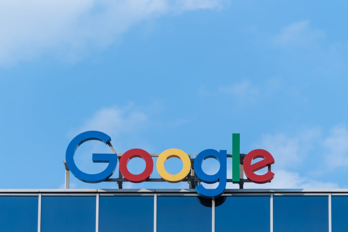
- Google – this company logo has always been colorful, even today. However, the order of colors as well as the lightness and the logo designs have been shaped through many changes over the years. After 1999, the logo was based on the Catull typeface, while in the following years, shadows and highlights were removed. This is a great example of a brand refresh. And now, the new logo is set in sans-seriff font.

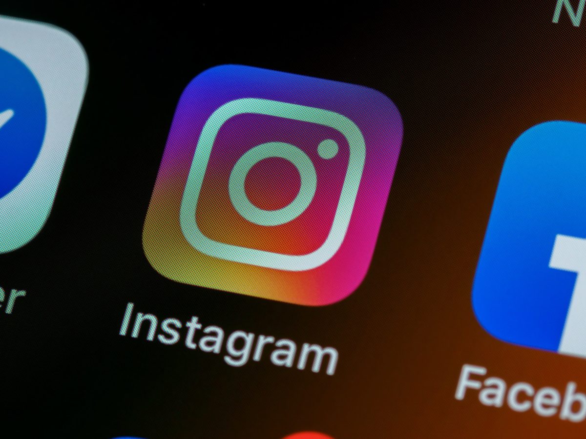
- Instagram – this is the only social media platform that has a colorful, modern logo, based on a gradient. The new logo design simply resembles a webcam built into a laptop or smartphone, which suggests that the portal is mainly used for publishing photos. That is the definition of a perfectly depicted brand identity;

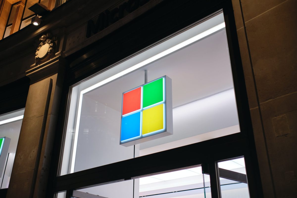
- Microsoft – yet another great brand. People using Windows can see their logo design every time they turn on their computers. From the beginning, there were many logo changes to find the appropriate typography. The latest one, which was created in 2012, refers to the company’s most famous product, i.e, Windows. This is the reason why it features a window symbol made of colored squares;

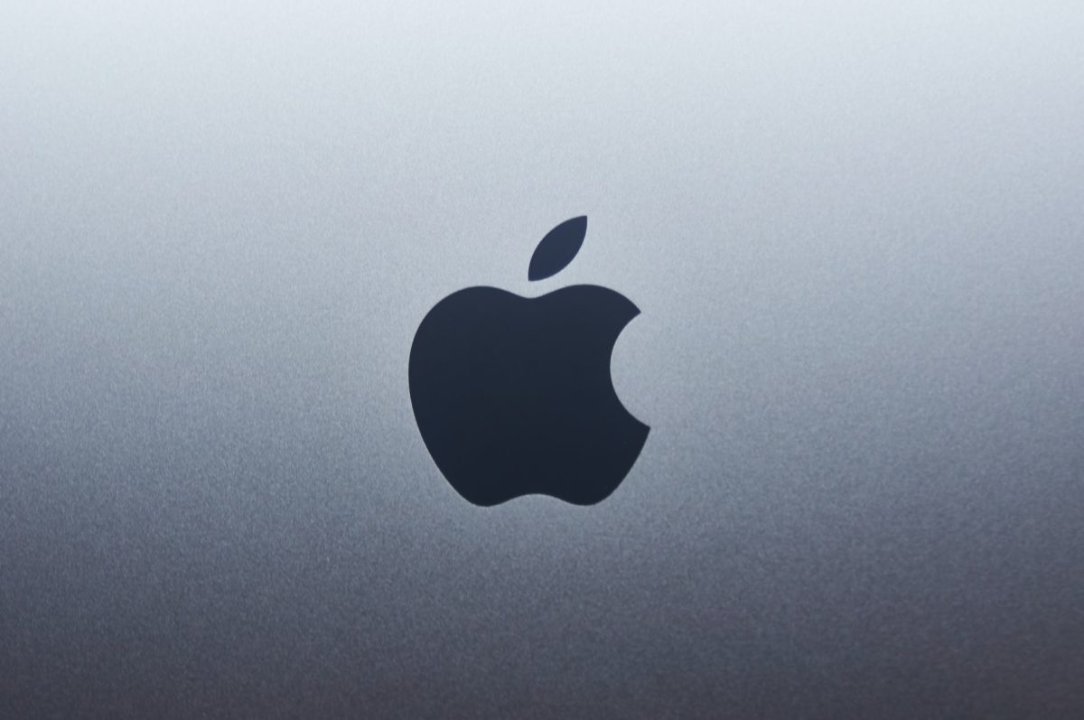
- Apple – this is, of course, a world-famous manufacturer of laptops, smartphones and other devices. Also known for its iconic original logo in the shape of a bitten apple. This symbol reigns supreme in the brand logo – only the colors were changed. However, it is worth knowing that it did not look like that from the beginning. At first, the logo was very complicated, as it illustrated the story of Newton and his discovery of the law of gravity. It was only a year later that the old logo was simplified. As a result, just the colored striped apple itself remained. Then the company began to focus more and more on minimalism. The current logo is legible and has had a 3D effect since 2001. This is a good example of a logo refresh.

- Audi – car brands also change their logos. In the case of Audi, in the new logo the proportions have been changed, and the famous intertwined circles look slightly different. The wording “Audi” is smaller and in red. This is one of the most famous successful logo redesigns.

If you want to update your old logo, remember that it is always worth reaching out to professional designers who know best how to do it. Nopio offers brand refresh services and custom logo designs – for new and redesigned logos. Discover the benefits of partnering with our professional branding services to transform your brand’s identity with expert guidance and creativity. On the Nopio blog, you can also read about the logo evolution and latest trends in branding.
