
This guide breaks down how to create a landing page that converts, guiding you through the process of selecting the right tools, crafting compelling content, designing with impact, and testing to ensure peak conversion rates.
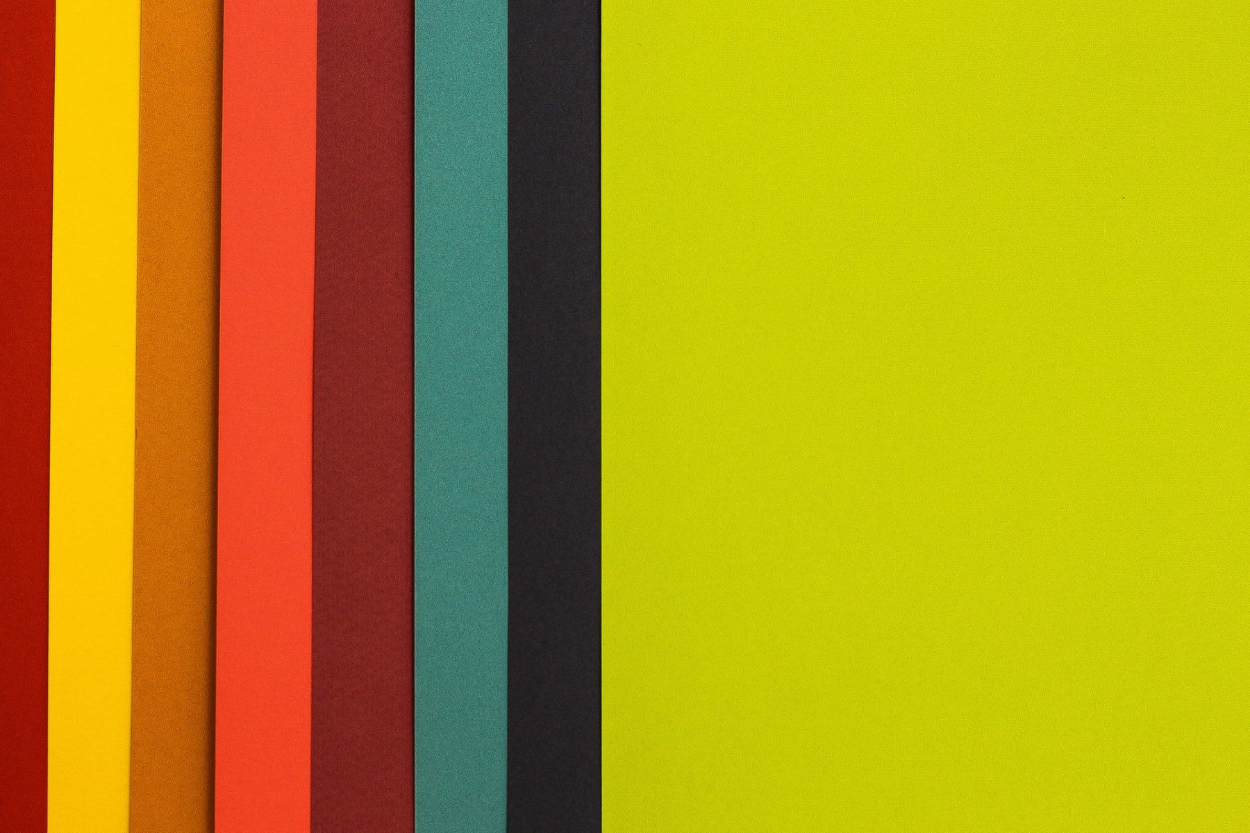
It is essential to take into account the website color matching during the process of its creation. The colors should form a cohesive whole and be user-friendly. It would seem that colors are not that important, and it is a simple task to choose them. Unfortunately, selecting the correct ones is not as easy as one would think. It is not enough to just follow your personal taste. Individual preference is helpful to some extent, but colors used on a website play a much bigger role. You should remember that colors can evoke different moods and thus affect the subconscious perception of the website by the user and their first impression. It is worth noting that the aesthetically combined colors make the website well-polished and professional. How to choose color combinations for website?
Color theory – color wheel, temperature, and chromaticity
Understanding of colors and their effects is essential if you want to create a good color scheme for a website. The screens are usually based on the RGB system – an acronym that stands for Red, Green and Blue. It is also known as “Additive Color System”. It works according to the principle that everything that reflects light is based on additive colors. Each primary color is used as the starting point. White is the combination of all colors, and black is the lack of any color.
The so-called color wheel shows primary, secondary and tertiary colors. The primary colors are yellow, red and blue. The secondary colors are created by mixing the primary colors, while the tertiary ones by combining the primary and secondary ones.
Colors can also be divided into hues, shades, tints and chromes. The hues or shades are the six unmixed primary and secondary colors. Adding white creates the so-called tint. The shades work in a similar way to the tint, but instead of white we add black. Chroma is the saturation or tone of the color. Chromes are created by mixing shades or colors with gray, white or black. So it can be said that color, shade and tint are also chromes.
Color temperature is also important for their classification. There are a few rules to follow in order to create a harmonious project. First, warm colors look more dominant when paired with the cool ones. This way you can convey the impression of depth, as cold colors seem more distant. What is more, bright warm colors might intensify the way you perceive cloder hues.
Shades of gray as well as white, black, brown and beige are neutral colors. They do not look great on their own, so they need at least one additional color to stand out. Obviously, there are exceptions. Black and white pages can look great, just like beige and brown ones.
You should also remember that the primary colors contrast with each other, but this sensation can be achieved differently. Colors that are on the wheel at intervals of three squares from each other can easily lead to disharmony when combined because these colors clash. However, when used appropriately, for example as a call to action, they can add an interesting contrast to the design.
Rules for creating a harmonious website color palette
1. Complementary colors
Complementary colors are placed on the opposite sites of the wheel. They create a contrasting yet harmonious color scheme suitable for dynamic and attention-grabbing designs. If you want to use them, make sure that they also reflect the product you want to offer.
2. Triadic color combination
The color triangle is a blend of 3 colors that are evenly spaced apart on the circle. This combination is also quite simple to use. It offers more variety, and is a safer choice when compared to the previous one. It works best for websites that target a wide audience. However, you still have to remember to choose the dominant color. This gives the design clarity and harmony.
3. Split complementary colors
Split complementary colors bear resemblance to the concept presented in the first point. But in this case only one side is separated, as the surrounding tertiary colors are used instead of the complementary primary color. This approach offers more combination possibilities. Adding a third color to the complementary pattern gives a little more balance to the scheme. This is an example of the best color combination for website. The third color is often used as an accent color, but its implementation is limited. This way you can give the website a slight contrast.
4. Square color scheme
Just like a triadic combination connects 3 colors, a square one connects 4. However, this is the most difficult blend method to master. In this case, two pairs of the complementary colors are mixed, but you need to have a good understanding and sense when it comes to the hierarchy, meaning they should be spaced in such a way that the color combination is not overwhelming. Use warm and cold colors harmoniously.
5. Square color scheme contrasted by the complementary colors
This blend is made up of two adjacent colors on the wheel with their complementary ones. You can create a really interesting color palette out of them. Using this method, you can give an interesting contrast to complementary colors and at the same time make a combination more diverse.
6. Analogous color scheme
An analogous palette consists of two or more colors lying next to each other on a wheel. Such schemes look less contrasting than the previous combinations, but do not lose their effectiveness.
7. Monochromatic color scheme
The monochromatic palette includes shades of the same color or chroma. This is the easiest way to achieve a color selection that is full of harmony. If used well, the website can really stand out. The use of monochromatic colors additionally strengthens the emotional influence of the main color and adds elegance to the website. However, it is worth noting that colors on monochromatic websites do not contrast much in general.
8. Chroma and a tint
This combination uses colors with similar tint and chroma values.
Matching website colors to the photos
Modern color palette for website is just one aspect of the design. If we decide to add photos on the home page, especially at the top, as the main graphic visible right after entering the website, we have to match the colors to them. Colors and photos must create a harmonious composition. Pictures are often the foundation for the rest of the colors on the website. It is much easier to choose the colors for the image than the other way around. A good method is to borrow the colors from the photos for the rest of the page. Thanks to this, all elements will interpenetrate and create homogeneous visual identity. Here are some online tools that can help you choose the colors for your photos:
- Canva;
- Colormind;
- Lunapic;
- PaletteGenerator;
- CssDrive;
- ColorFavs.
Best colors for business website
In order to find good colors for a corporate website, it is also worth considering color psychology, i.e., the associations they evoke. Different colors will send various messages to users, changing their perception of the page, even if it was not intended.
Color palette for corporate website
Popular website colors for a travel agency are yellow or green. They are associated with the sun and nature, as well as the summer, which is the period when most people go on vacation. Blue color for website, associated with sky and water, would also be a good choice. However, this approach to the design is too simple, as color psychology is also based on associations that we may not even have a clue about. For example, red is mainly connected to love, but also to energy, bravery and speed. Yellow color brings connotations to joy and optimism. Green color for website is perfect if you want to evoke such feelings as hope, calmness, a sense of security, development and credibility, meanwhile blue is associated with health, stability and confidence.
At first glance, this does not seem plausible, but scientific research has shown that red can make your heart beat faster, while blue can calm it down. Switching the street lighting to blue in Glasgow in 2000 resulted in a sudden reduction in the number of crimes committed. Another example comes from Tokyo, where they put the blue light at the ends of the railway platforms to reduce the number of suicides committed there. It decreased by as much as 74%. This may also explain why blue is used by medical and pharmaceutical companies.
The importance of color psychology
Many users make purchasing decisions based on colors alone. According to research, as much as 90% of quick purchases result only from the perception of colors on the website. In color psychology, the color is supposed to have a specific effect. Therefore, when you choose a color palette for corporate website, you should pay attention to colors that evoke specific emotions in users. In this way, you can make them more likely to get interested in the website and as a result, fulfill your business goals, i.e., make a purchase. Considering color psychology is a valuable aspect of creating a website project plan.
Age and gender effects on the color perception
When designing a website, it is utterly important to know its target audience. A lot depends on both the gender and age of the users, as everyone reacts differently to colors. There is a study that was conducted on a group of 2,000 men and women who were asked whether they prefer blue, red, purple, pink, orange, green, or yellow. As many as 42% of men chose blue, 25% green and 12% purple. Women usually selected the same colors, but purple was more popular than green. The difference is not that great, but it can actually have an impact on the website’s success.
Color scheme for website – what colors should you avoid?
The least popular colors also have to be taken into account. However, not the ones we like the least. The fact that you do not like blue does not mean that others have the same feelings towards it. As for the colors that users find appealing, the study found that, regardless of gender, brown and orange are the ones that are not very popular. 17% of women also indicated gray. However, it is difficult to distinguish colors that will not match our website.
A lot also depends on the region where we want to do business. In Poland, it is most often the case that men do not like pink, but in Italy this color is considered very masculine. Trends and individual preferences are also important. For example, nowadays, pastels are popular, yet tomorrow this may change and vivid and bright colors might be considered more attractive.
The most common colors are red, green, and blue. They can be thought of as safe. However, there are exceptions. Green or blue should not be used on websites selling food. The former color is mostly associated with vegetables, while in the case of other products, both green and blue can evoke associations with decay as they both resemble mold. The same thing goes for black or brown, as these colors are associated with rot. Keep in mind that a poorly chosen color scheme can contribute to an outdated website, making it appear old-fashioned and unappealing to users.
What is the perfect number of primary and additional colors in the design?
There are no ground rules regarding the number of colors, but it is worth remembering that the more colors, the more difficult it is to create a uniform, harmonious design. This aspect depends on the industry you work in as well. For example, fashion and interior designers say that in order to create perfect harmony when using three colors you should use the 60–30-10 ratio. This method is said to ensure the right balance between brightness and shadow. The primary color should take up to 60% of the space and form the overall theme of the entire project. The subsequent color used in 30% should contrast with the primary color in order to create a good visual effect. The last color, which takes only 10% of the space, is the accent color and should complement the primary or additional color. The best example of this principle is … a men’s suit. Black or gray trousers with a jacket are 60%, a shirt 30% and a tie 10%.
The primary color that will dominate the page is the most important. The next colors should be selected, so they match it. The most classic option is to choose three colors, but you can opt for four – the above-mentioned color square combination. However, it is worth deciding on a shade of the already picked color, which will result in a uniform design without the need to use other colors. Thanks to this, we also avoid the risk of an additional color mismatch.
The font color in website design
In addition to the background color of the website and its content, it is also important to choose the appropriate font color. Black is the best choice because our eyes have got used to the contrast of black letters and white sheets of paper over centuries of reading books. However, what appears black to us is not entirely black. You can rarely find completely black texts on websites – it is just a very dark gray color. True black is too sharp and differs in quality by clashing with other colors, especially in the case of text on a white background. This color will only work for headlines as it allows them to stand out perfectly from the regular text. Remember that dark gray or pure black may be unreadable on dark backgrounds. If you opt for the dark website, it is better to decide on a light font. Even white will work here.
Font color decisions significantly impact user perception, but the foundation of successful website design lies in wireframes.
What are the most popular corporate website colors?
The favorite color that is commonly used on websites is, of course, white. It is the most natural color that contrasts perfectly with other elements on the page. It allows the user to ‘slow down’ and gives time to better process the information on the website. Unfortunately, many pages are packed with details that distract visitors from what is most important – content and minimalism. The latest trend is the so-called ‘dark mode’, which is a night mode that inverts the colors of the text and background – turning background black and text white. Such a composition is less tiring for the eyes and lowers power consumption. It is worth using this contrast on your website. The combination of black and white is the safest solution because these colors will probably never go out of style.
What elements should be in color on the website?
There is no single, simple rule here, either. It all depends on the colors chosen, the good sense, and the information that you want to include on the website. You can consider the following suggestions to make your task easier. The primary color can be used in the so-called “hot areas” to attract and encourage users to take action. These are buttons, icons, headers, and other crucial elements. Therefore, many designers select a vivid and eye-catching color to fulfill that purpose. Less important information, such as links, menu items, or other supporting content, can be highlighted with a secondary color. It can also be used as a background for selected sections. Tertiary color is best used for small things that should not be conspicuous, such as frames, icon fragments or underlines. It also matches the color that appears when you hover over a link or button.
Gradients and color combinations for website
A gradient is a tonal transition between different colors. However, it is quite a dangerous operation when it comes to websites. Properly used, they can add a modern and fresh look to a website, yet its implementation is rarely a success. People often mix colors that do not match. As a result, many websites with gradients look as old as they came from the previous decade. In the gradient, it is best to use similar colors and tones, i.e., shades of the same color. The gradient will then look modern, resembling a gloss or a slight discoloration that gives the page an original look. In case of different colors, it is worth adding a few intermediate colors between them so that the transition is smoother and more aesthetically pleasing.
How to choose colors for website – is it better to do it yourself or ask a specialist?
Designing a website, including choosing the right color palette, is not an easy task. Of course, you can do it yourself with the help of a variety of tools that will enable you to select colors for web design, e.g., Canva, Colormind, or PaletteGenerator. Applications such as Adobe Kuler, Paletton, Design Seeds, Coolors.co, and Color hunter can also be of help. They will allow you to analyze different color combinations and even sample a color from a photo. However, even using applications requires a great deal of knowledge about color. So if you do not feel up to the challenge, it is better to outsource it to a specialist. Nopio offers, among others, website design services. We can also help choose colors for website. Here are three examples of projects completed by Nopio:
- The Center for Couples & Sex Therapy – the project where color combination for website consists of blue, green, and burgundy. Blue and its shades convey trust, loyalty, wisdom, intelligence, and truth. Green is associated with growth, harmony, freshness, fertility, security, and peace. Burgundy, on the other hand, is associated with love, friendship, and romance, so this color was kind of obligatory on the Therapy Center website. When it comes to color arrangement, the main background is green, the main header and graphics have a maroon background, while the footer background is blue. You can see the results HERE;
- Genea – this design is based on a combination of white and blue. The blue color is best associated with modern technologies that Genea delivers. The whole project and effects are presented HERE;
- Erlang Solutions – this company is an expert in producing resilient and enormously scalable distributed systems. Nopio has created color combinations based on white, black and blue with the addition of green and purple. You can see and read more HERE.
Website design is a huge challenge, so it is best to hand it over to a specialist who will perfectly match the colors and all other elements. Appropriate colors for web design are very important for the first impression of users, who only need a dozen or so seconds to formulate an opinion. We hope this article will help you design your website and understand how important it is to choose the right colors.